You can probably rattle off a list of colors you like and dislike, but did you know that your gut response to various shades might be deeper than you think?
Researchers and skilled marketers have explored the link between colors and emotions, delving into the science of color psychology. And while there’s plenty to be said for the fascinating and ever-expanding research into the scientific aspects of this topic, for now, we’re going to stick to the focus area that matters to us most: how to use the psychology of color in advertising and branding.

What is Color Psychology?
Color psychology is exactly what it sounds like: the psychology of color. Essentially, it’s the study of how different colors affect human perceptions and behaviors.
In branding and marketing, color psychology looks at how certain colors can influence consumers. Marketers are interested in how a specific color could impact a person’s first impression of a brand, their decision to make a purchase, and their preference for one brand over another.
A 2006 study found that most people have formed an initial impression within 90 seconds of the first interaction with a person or product. What’s even more surprising is that upwards of 90% of that first impression is based entirely on colors, which is data that’s bound to turn marketers’ heads. Based on this and a multitude of other research, it’s fair to say that in marketing, colors play a pivotal role in the overall effect of a branding or advertising campaign.
Common Misunderstandings About the Psychology of Color in Advertising
The connection between color and psychology might not be news to you. In fact, many people have seen articles, infographics, and other information that promises to answer questions like, “What do different colors mean in marketing?” or “How do consumers react to certain colors?”
However, there’s a major problem with resources like these. In general, it’s impossible to condense the complexity of color psychology into an oversimplified guide that equates each color to a specific emotion or reaction. There’s no universal translation for color psychology, mainly because people’s thoughts, feelings, and reactions heavily depend on their personal experiences, cultures, preferences, and even upbringing.
So, before you believe statements such as “blue equals calm” or “yellow means optimism,” it’s important to realize:
When it comes to color psychology and marketing, context is what really counts.

How to Use Color Psychology for Marketing and Branding
Using color to create a psychological impact is all about context, especially if you aim to achieve certain branding or marketing goals. While it would certainly be much easier to have a clear-cut method for decoding colors and their meanings, it’s just not that simple.
When you’re searching for the best colors for marketing and branding, the context you’re working within is always going to be key. Ask yourself what kind of feeling, mood, and effect you’re hoping to create, and then consider how you can work backwards to create materials to match. Choosing colors is absolutely a part of successful marketing, but it’s not the only thing that matters.
That doesn’t mean that the psychology of color is meaningless for marketers; actually, it’s quite the opposite. Research about color psychology can be very useful in making smart, effective decisions for your marketing strategy.
Here’s how:
1. Consider which colors are appropriate for your brand.
In 2006, researchers found that one of the most important links between color and branding is how well a selected color fits the products/services being sold. In other words, it’s vital to focus on choosing a color that makes sense for your brand. From a consumer perspective, are your selected colors appropriate for your business?
For example, if your business sells software products for corporate use, vivid shades of magenta, purple, and baby blue might not be the most fitting of options. Conversely, a company that creates custom birthday party décor for kids probably wouldn’t want a color scheme of browns, blacks, and grays.
If you’re struggling to figure out if a color is well-suited for your brand, requesting customer feedback can be helpful.
2. Use colors to highlight your brand’s personality.
One of the primary reasons that color can affect purchasing intent has to do with how colors influence a consumer’s perception of a brand. Basically, every brand is perceived to have a certain “personality,” and color psychology can shape the way consumers view yours.
Try to get away from stereotypical color associations and instead focus on choosing colors that fit your brand personality. An academic paper called “Dimensions of Brand Personality” suggests that five dimensions make up the personality of a brand. Usually, a brand’s personality is dominated by one of these dimensions (though in rare cases, they can be a combination of two):
- Sincerity
- Excitement
- Competence
- Ruggedness
- Sophistication
Based on what type of business you’re marketing, it’s probable that one or two of these dimensions jump out at you. Pinpoint which dimension you want consumers to associate with your brand and how you can use color to convey the related characteristics.
3. Choose colors that will appeal to your target audience.
Even though our society has made significant progress in breaking down gender stereotypes, it turns out that there are still many “old school” influences on color preferences and appropriateness. For example, most people associate blue with products for boys and pink with products for girls. Even though this is a preconceived notion that most often applies to products/brands for babies and children, it’s not something that disappears in adulthood.
That being said, restricting your color selection based on stereotypical gender and color norms alone shouldn’t be your go-to approach. Rather, think back to the personality you want your branding materials to convey and how (or if) gender-related color perception is related in any way. Then, look at the big picture of branding and color: what shades is your target audience most likely to find appealing? That matters far more than the dividing line between pink and blue in the grand scheme of things.
4. You can use color to set your brand apart.
A psychological principle called “The Isolation Effect” explains that you’re more likely to remember an item when it stands out distinctly. When you see an image or text that sticks out from its surroundings, it’s more likely that you’ll recall it later. This is something that most marketers and business owners have long considered to be common sense, but it’s worthwhile to know that it’s a concept backed by science.
So, while it might be tempting to follow the example of successful brands in your niche, it may be even more productive to pick colors that differentiate you from those competitors.
5. Color can help “coach” your customers towards action.
No, you can’t manipulate color schemes to convince all of your customers to make big-ticket purchases – that’s not quite how it works. However, you can devise a hierarchy of color that helps encourage consumers to progress through the customer journey and complete a specific action.
Finding an effective combination of background, accent, and base colors can make a big difference in your conversion success. It’s not that certain colors are more effective for conversion; instead, it’s the combined effect of an entire color scheme that carries the most weight.
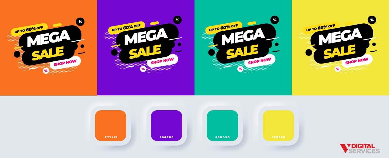
A regularly-cited example of this idea highlights a 21% increase in conversions after changing a CTA button from green to red. Many people mistakenly assume that this improvement is due to the supposedly powerful effect of the color red. Understanding the “why” behind the shift requires looking at the entire color palette. Initially, the page used a palette that relied on various shades of green. So, a green CTA button blended in with the rest of the content. Once the button was red, the increased visual contrast of a complementary color made it far easier to catch the user’s eye.
Color Psychology and Marketing: The Key Takeaway
So, does color really matter for marketing? The answer to this question is an obvious yes, but the reasoning doesn’t boil down to ideas about color psychology alone. If you want to use color for branding and marketing effectively, you can’t ignore the context of the situation. Color is just one piece of the puzzle, but it’s up to you to put everything together and create the picture you want.
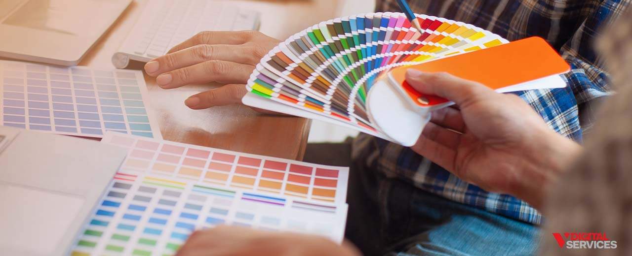

Figure Out the Best Branding and Marketing Tactics for Your Business
There might not be a color psychology cheat sheet for you to use in your next marketing campaign, but there is a team of experts ready and waiting to hand you the keys to success.
V Digital Services is a digital marketing agency that values creativity, innovation, and data-driven strategy, relying on proven tactics and client goals to guide each and every campaign. We understand how color and other factors work together to give consumers an impression of your brand. Our team has the skill and expertise to ensure your branding and marketing materials are saying exactly what you want them to.
Get more information about how color impacts marketing and what that means for your brand by contacting the V Digital Services team today.
Image Source: Bagel Studio / summer studio / ilani / StarLine / Dmitry Kostrov / Wasan Tita / Shutterstock
(Updated: February 24, 2022)
