In the design world there is a common lingo that can sometimes be foreign and confusing to the untrained eye. For non-designers, it can be helpful to understand some of the basic terminology when you communicate with your designer, so you can better articulate what you like and dislike.
Below is a list of eight commonly misinterpreted design words that will help you better understand and communicate about this interesting art form.
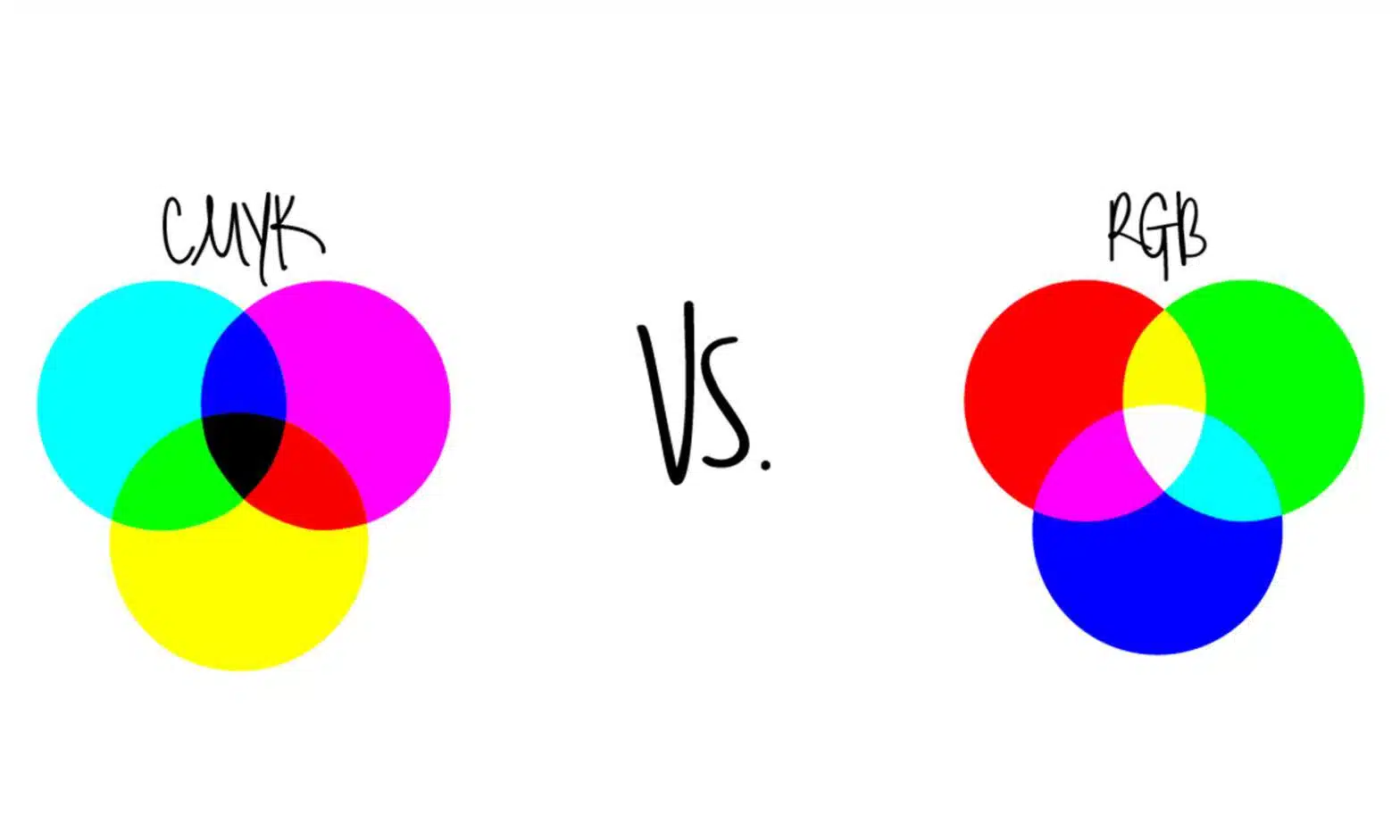
CMYK vs. RGB
There are two different color settings when it comes to creating print or web graphics, CMYK and RGB. CMYK stands for cyan, magenta, yellow, and black, which is the color model that is commonly used in printer ink. This means that selecting the setting of CMYK will be an important step in order for the right results to be printed as desired.
On the other hand, RGB stands for red, green and blue, which is the color model used when designing anything that will live in an electronic system. When designing for a digital platform, such as a website, the RGB setting will need to be chosen in order to achieve the correct outcome.
If these two color models are used for the wrong medium, the colors will not be displayed as intended. Be sure to communicate with your designer about whether the project will be used electronically or in print. If the product will be used for both outlets, it is crucial to communicate that, so the designer can create two different files with the correct color model for each.
Font vs. Typography
To put it plain and simple, font is a basic digital file of the alphabet and symbols in one style, size and weight.
Typography is where the artistic side of things really flourishes; it is the style of letters arranged in an aesthetically-pleasing way.
The choice of both the font and the typography of a project are items that can make your design stand out from others.
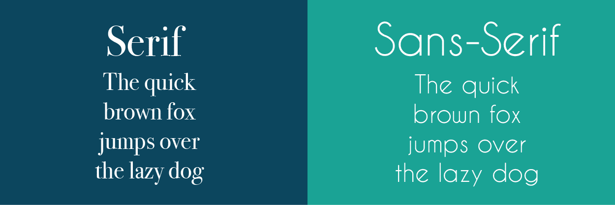
Serif vs. Sans Serif
Within fonts there are two primary styles, serif and sans serif. The two are easily confused because of the similarity of their titles.
A serif font is letters that have the little tails on the ends of them and sans-serif fonts do not have any of those tails.
An easy way to remember the difference is that sans literally means without, which explains why sans serif would be the letters without any tails.
Here is a visual example:
Logotype vs. Logomark
Logos can be a complex process for both the designer and the client. Oftentimes the client isn’t able to clearly communicate what they envision. However, with an arsenal of new terms at the ready, it can help expedite the logo creation process.
First, a logotype is the company name spelled out in an eye-catching way by utilizing font and typography.
The logomark, also known as the brandmark, is a custom-designed symbol that represents your company. Keep in mind that logos do not need a logomark in order to stand out, but it can be an easy was to give your business name some personality.
The logotype and logomark contribute heavily to your company’s identity, which is important to think about when branding your business. You hold the choice to be known by your name or by your name plus a symbol.
Branding vs. Marketing
You would think that these two terms would not get mixed up, but they often do. To put it into layman’s terms, branding is your company’s personality and business strategy. It’s the logo, the color scheme, the fonts and style. When creating your brand identity it is important to stay consistent with your specific theme. Once the brand has been established, you want others to know about your business and buy your products and/or services, which is where marketing comes into play.
Marketing is the promotion of your particular products and/or services through the appropriate outlets whether that is advertisements, newsletters or social media.
PNG vs. JPEG
It’s safe to say that we all know that these are photo files. You may think that they act the same, but that is not the case. PNG’s are low-resolution images that have been compressed. They have an amazing capability that allows an image to have a transparent background, which is essential for logos.
JPEGs are also compressed images with the ability to choose the size and/or quality of the image. They are best for complex imagery with many colors and do not allow a transparent background.
Remember that in order to maintain a transparent background when sending logos, keep them in their original PNG file format.
Low Resolution vs. High Resolution
The resolution of an image depends on the DPI (dots per inch) that the photo has been made or exported as. A low-resolution image typically has the DPI of 72 or lower. This means that the quality of the image will be more pixelated because there are not as many dots per inch to give the photo clarity, making it essentially unusable.
A high-resolution image normally has the DPI of 300 or higher, which will create a clean, crisp and detailed image due to having many more dots per inch.
When sending imagery to graphic designers, you always want to make sure the image you have chosen is set at a high resolution, especially if it is for a larger scale design like a webpage. If a low-resolution image is sent to a designer, he or she can try to increase the resolution but this can sometimes damage the quality of the image altogether.

Stock Photography vs. Custom Photography
There are pros and cons for each type of photo, but one far outweighs the other. If you need images for your advertisement, webpage or other collateral, stock photography is an option to find high quality, photos quickly and easily. The downside is that these images are also available for everyone else to purchase, so it takes away creativity for the designer, and the photos can sometimes give off a “fake” feel to your business.
Customers like to see personality now more than ever, which is where custom photography takes over. The benefit of having custom imagery is far greater than what stock photos can provide as no one else will have the photos you take and create.
These images can feature the things that your customers want to see: employees, locations, services and products. People are drawn to something they can relate to and like to know that the people, places and things in images are real and an actual part of your company. The downside of custom photography is that it costs more and takes a lot more time. Though there are a few cons to having custom imagery, the pros have the potential to reach more customers and bring in more revenue.
V Digital Services
With these terms under your belt, you are sure to not only impress your graphic designer, but also get the creative results you are looking for to boost the quality of the visual brand of your company.
Looking to give your brand a boost? Contact V Digital Services for more information on our expert graphic design and web design services.
