Graphic design is a skilled profession, but it’s also basically an entire world with a language all its own. And if you don’t arrive with a solid familiarity with some basic design terms, you might just find yourself wishing you had a translator on hand.
If you’ve ever been confused by graphic design terminology, this vocabulary guide is the resource you need to cut through the jargon. We’ve assembled 120 terms, essentially covering the ABCs of graphic design – it’s the graphic design vocabulary handbook you’ll come back to time and time again.
120 Graphic Design Terms to Know Now
Alignment
Alignment describes the way that various design elements are arranged in a page or document. For example, you’ve probably heard of center, right, and left alignment. If you’re talking typography, alignment (also called “range”) refers to the setting of the text in relation to a page, column, or tab.
Analogous colors
Analogous colors sit directly next to each other on the color wheel, such as red, orange, and yellow. In this trio of analogous colors, there is a dominant color, a primary/secondary color, and a tertiary color, and they all come together harmoniously for an effective design.
Aperture
Aperture is the white space located at the end of an open counter, specifically in typography.
Apex
The apex is the top/highest point at which two strokes are connected, specifically in typography.
Arm
An arm is a horizontal stroke that isn’t attached to a stem on one of its ends.
Ascenders
Ascenders are the portions of lowercase letters that reach above a typeface’s x-height. This will vary depending on the specific typeface, with some fonts’ ascenders extending above cap height. Most typefaces count the letters b, d, f, h, k, and l as ascenders.
Aspect ratio
Think of aspect ratio as the ratio of the width of a rectangle to its height. When discussing design, the rectangle in question is usually a screen or picture. You’ll typically see aspect ratio expressed numerically, with two numbers separated by a colon (width:height). For example, a computer screen may have an aspect ratio of 16:9, measuring 16 inches wide by 9 inches high.
Backslanted
Italicized font leaning in a backward direction.
Ball terminal
The ball-shaped extension of a letter.
Baseline
The invisible line that text sits on top of, almost like a “floor” for text. The baseline is where the x-height and other key characteristics are measured from.
Bleed
Bleed is a term specific to printing. It is the extra edge (of the artwork or background color/pattern) that will be trimmed off. Essentially, the bleed is used to avoid any unexpected white space or borders and prevent any key design elements from being trimmed off.
Body copy
Body copy is the main portion of text that people will be reading within a design. For both print and digital publications, this is the paragraphs/sentences that make up the main content, not counting titles, subtitles, author/illustrator names, etc.
Bold
Bold is a typeface’s heavyweight, commonly used to emphasize specific text.
Bowl
Bowls are the primarily round/elliptical forms that make up the basic shape of letters such as uppercase C, G, and O and lowercase b, c, e, o, and p.
Bracket
A bracket is the curved connection that links the serif and stem of some fonts (not every font has bracketed serifs).
Brand identity
Brand identity is a comprehensive concept that includes everything that contributes to a brand’s visual version: slogans, logos, color palettes, typefaces, tone, packaging, website design, and all marketing materials. It is both the “look” and “feel” of a brand and should be a carefully developed aspect of any business. Developing a brand identity is a process known as “branding.”
Calligraphy
An artistic approach to writing that utilizes specialized tools such as a brush pen. There are also many calligraphy-style fonts.
Cap height
Cap height is the measurement from the top of a capital letter to the baseline. This term is used in relation to flat-top letters, such as H or J. However, rounded or pointed uppercase letters (O, A, etc.) can extend above the cap height.
Center-aligned
Center alignment places text or visual elements directly at the center of the page or screen.
Character
A character is an individual letter, number, symbol, or punctuation mark.
Character set
A character set is the full collection of characters for a typeface weight (all letters, numbers, symbols, and punctuation marks).
CMYK
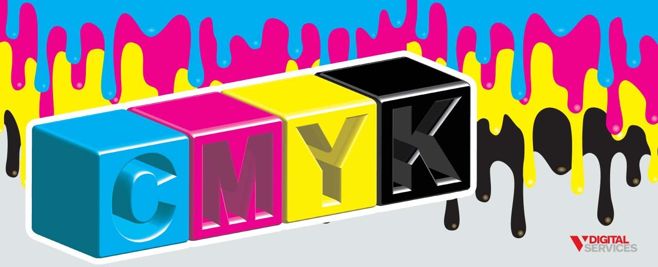
CMYK is an acronym for Cyan, Magenta, Yellow, and Key (Black) and is the color mode used for print design. Much like its close cousin, RGB, CMYK is made up of four colors that can be mixed in a multitude of ways to produce most of the colors for print. What makes CMYK unique is that they are subtractive colors, meaning they get continuously darker as they are combined.
Complementary colors
Complementary colors sit opposite or across from each other on the color wheel. For example, blue and orange are complementary colors, as are purple and yellow. These colors are the ones that we think of as “going together” well, making for an aesthetically-pleasing design when used together.
Contrast
Contrast is the arrangement/balance of opposing elements on a single page. For example, contrast can refer to light vs. dark colors, text color vs. background color, and so on. Contrast is an effective way to create visual interest within a design.
Counter
Counter is the white space that is wholly or partially enclosed within a given letterform, such as “d,” “o,” or “c.”
Creep
Creep, or singling, is the inside margin of a publication (book, magazine, etc.). Certain bindings require the creep to be larger so that all content can be visible.
Crop marks
Crop marks, or trim marks, indicate where paper will be trimmed during the printing process. They look similar to two lines crossed by a target. Crop marks are critical information to provide to a printer to ensure correct trimming.
Crossbar
The crossbar is a stroke across the stem of a letter, such as the horizontal lines in the letters “T” and “H.”
Descenders
A descender is the “tail” portion of a letter located below the baseline. In most fonts, only lowercase “g,” “j,” “q,” “p,” and “y” are descenders, though a limited numbers of fonts have a few additional.
Display type
Display type is used to refer to fonts that are specifically designed to be eye-catching and are commonly used for things such as headlines, billboards, logos, and posters.
Ear
The ear is the stroke connected to the bowl of a lowercase “g.” You may also hear it used for lowercase “r.”
Ellipsis
An ellipsis is a character made up of three dots (…).
Embossing/debossing
These are finishing processes used to create dimensional relief images on a card or paper. A printing press can “lift” a design into a paper (embossing) or “sink” it into the paper (debossing).
Extended
A character that has an exaggerated width, like an accent mark.
Foiling
Foiling, or foil stamping, is a special type of printing that uses metallic or pigmented foil. This foil is applied using heat and a die and can effectively add dimension and visual interest to a design.
Font
A digital file of characters in a specific style, weight, and size.
Font color
The color used for a specific font in web design.
Font size
The height of a given font, generally measured in points from baseline to baseline (for example, 12-point).
Font weight
The thickness of a font, both as an individual font and as a certain font style. Font weight is a range (100 to 900). A “normal” font weight is generally 400, extra-light is 100, and 900 is extra-black.
Golden Ratio
The Golden Ratio is a principle that dates back to Ancient Greece, used as a guideline for making attractive, well-balanced designs. The idea is that when you have two objects and divide the larger by the smaller, the goal should be to get as close to 1.6180 as possible.
Gradient
A gradient (color gradient) is a gradual change in shade or color or a color that fades into transparency. A gradient can be radial or axial/linear.
Grayscale
Grayscale is a color palette using only black, white, and shades of gray.
Grid
A grid is an underlying system of vertical and horizontal columns/guides. Designers regularly rely on grids for accuracy, structure, and consistency.
Hand-lettering
The practice of creating custom letters rather than using a pre-made font/typeface.
Hard/soft return
Both a hard and soft return involves hitting the “return” key to move to a new line of text. However, a “hard return” is used to create a new paragraph, whereas a “soft return” is a new line within the same paragraph.
Hex
A six-digit code that represents a specific color frequently used in CSS and HTML and often included alongside RGB/CMYK in various applications.
Hierarchy
Hierarchy is a basic design principle used to establish a sense of organization and direction in a design. It is used to make it easier to read and understand text, as the creator/designer intended.
Hooke
The curved arch on a letter, such as the one atop letter “f.”
Icon
An image used to represent an action or object. For example, a magnifying glass is an icon frequently used to indicate “search,” such as on an online search engine.
Italics
Characters slanting forward.
Joint
A stroke connecting with a stem.
Justified
A type of alignment that aligns text to the left and right margin within the text frame, without a rag on either side.
Kerning
The space between two letters or characters, as well as the specific process of precisely adjusting this spacing. Kerning can be used to improve legibility and balance typographical proportions for a more attractive final result.
Leading
A graphic design term (pronounced “ledding”) for line-spacing, specifically the amount of space between two baselines of text. Larger leading provides more space and is usually preferred for a better look.
Left-aligned
Text aligned with the left margin.
Leg
A short stroke extending downwards.
Ligature
The point at which two or more letters are joined as a single character.
Link
The stroke that connects the bowl and loop of a lowercase “g.”
Logomark
A company’s logo that does not contain the brand name. Generally, a logomark is a simplified shape/character that visually represents the company, such as the bird used for Twitter.
Logotype
A logotype, or wordmark, is a brand’s name styled as its logo. For example, Disney and Google are two very famous logotypes.
Lowercase
Lowercase letters are the non-capitalized letters and make up the majority of written text.
Margin
The blank space between a page’s content and its edge. Adjusting margin width can dramatically change the look and feel of a design.
Masthead
The title design for a publication’s name, most commonly found on a magazine cover. Masthead is also used to refer to a text title or graphic image located at the top of a webpage.
Mock-up
A realistic representation (often three-dimensional) of a design, used to show how a design will actually look when completed. The purpose of a mock-up is to clearly demonstrate what a brand or campaign roll-out will look like.
Monochrome
A color palette using various tones and shades of just one color.
Monospaced
A typeface in which all characters are the same width, also known as fixed-width, fixed-pitch, or non-proportional typefaces.
Moodboard
A moodboard is a collection of visual references for a design project and can be in either digital or physical form. A moodboard might feature photos, typography, images, colors, and other design elements and is useful for developing a specific aesthetic, idea, or concept.
Orphan
An orphan is a single word (or a short line of two to three words) sitting alone on a new page, column, or line.
Palette
A palette, or color scheme, is a collection of colors selected for a certain style or brand.
Pantone (PMS)
The Pantone Matching System is a standardized color scheme used for graphic design, printing, and many other industries. Each color within the PMS is assigned a unique number and name for easy reference and reproduction.
Pilcrow
A symbol (¶) used to indicate a new paragraph or text section.
Pixel
The smallest basic unit of programmable color. All digital images are composed of a large number of individual pixels.
Placeholder text
Also called “dummy” or “filler text,” it’s used to demonstrate how and where the final copy will be situated within a design. You’ve probably seen placeholder text in the form of the words “lorem ipsum.”
Point size
The distance from the bottom of a typeface’s lowest descender to its highest ascender.
PPI/DPI
PPI (pixels per inch) and DPI (dots per inch) are two units used for measuring resolution. PPI is used for digital images, whereas DPI is used for printed images.
Printer’s proof
A print sample, or mock-up, of a design used to double-check all elements before ordering a final print run.
Quick keys/shortcuts
A designer uses quick keys/shortcuts to complete certain functions with one click, streamlining various aspects of their work. For example, if you’re using a Mac, pressing the ⌘ key (Ctrl key on Windows computers) in conjunction with the letter “C” can be used for the Copy function.
Rag/ragged edge
A ragged edge occurs when a design’s body copy has uneven line lengths, creating a visually noticeable “shape.” Kerning and tracking are two simple strategies for resolving a ragged edge.
Raster image
A type of graphic image that is made up of a certain number of pixels. Raster images are not usually recommended for resizing because they can lose quality and end up blurry.
Readability
The degree to which text is able to be easily read.
Repetition
Using the same design element more than one time within a single design, often for consistency and cohesiveness.
Resolution
The number of units in a linear inch of an image (in PPI or DPI), both in print and on-screen. Resolution is usually used to indicate the quality of an image, with higher-resolution images being higher-quality.
RGB
RGB (Red Green Blue) is the color mode used for digital design. The three colors can be mixed in many different ways to produce any color on the visible spectrum, growing increasingly brighter the more they are combined.
Right-aligned
When text is aligned with the right margin, with the rag located on the text frame’s left side.
Rule of Thirds
A useful guideline for devising an aesthetically-pleasing alignment. This concept uses an “invisible” 3X3 grid, suggesting that the primary subject of an image should be aligned with the intersection points or guidelines. Alternatively, the various elements should flow throughout the grid.
Sans serif
Sans serif fonts are those without serifs on the ends of letters and are usually selected for better readability for web and digital design.
Saturation
The brilliance and intensity of a color, typically expressed as a number measuring the degree to which the color differs from white.
Scale
The relative size of an object(s) within a design, often used to create a sense of hierarchy or add interest.
Script type
A font based on (traditional or modern) handwriting, either formal or casual. Formal script fonts are the more traditional form and are based on letterforms of the 17th and 18th centuries. Casual script fonts gained popularity in the 1970s and commonly look to be painted using a wet brush.
Serif
The small line appearing at the end of a letter in some fonts/typefaces, which are called “serif fonts.” Generally, serif fonts are ideal for printed design due to optimal readability.
Shoulder
A curved stroke that connects to a stem.
Skeuomorphism
When something (typically a digital element) is designed to look like a physical replica of an item but does not necessarily have the same function or behave in the same way. One example is the often-used phonebook icon for smartphones’ Contacts apps.
Slab serif
Slab serif are a version of serif fonts with distinctly thick serifs, which can be rounded or block-style.
Stem
A vertical stroke, specifically in a letterform.
Stock photo
Licensed images that can be used for design purposes (via purchase and/or through a designer) instead of original photography/images.
Stress
A vertical or diagonal change in the width of a stroke across a letter.
Stroke
Any linear feature of a letter.
Style guide
A style guide is a set of branding standards for a publication or business, encompassing all of the key details that make up a brand’s identity. These standards establish the core characteristics to be used for all brand-related items, including website designs, business cards, print ads, and more.
Swash
The addition of a decorative stroke (typography).
Symmetry
A fundamental principle of design that relates to a sense of harmony and balance within a design.
System font
The primary font that is used by a computer’s operating system.
Terminal
Any letterform stroke that does not end in a serif (can be curved or straight).
Texture
A design’s visual appearance. Texture can be created through the layering of graphics, the imitation of real-life material textures like fabric or metal, or by printing on different paper stocks/materials.
Thumbnail
A small, simple sketch of a design, usually created in the early stages before computer-related design work begins.
Tittle
A tittle, or superscript dot, is a small distinguishing mark above a letterform. It is usually used to refer to the dot above a lowercase, “i” or “j,” though there are tittles above letters in other languages as well.
Tofu
A graphic design slang term for the squares displayed when a typeface isn’t loaded onto a computer (or doesn’t have a certain glyph).
Tracking
The spacing of an entire word or paragraph. By changing the tracking, you can adjust the space between every letter within a paragraph/word at once, shifting the structure and density as a whole.
Triadic colors
A triadic color scheme is made up of three colors that are equally spaced around a color wheel. The best-known triadic color scheme features the primary colors: red, blue, and yellow. Ideally, these color schemes will have a single dominant color and two secondary/accent colors.
Type classification
The type of characters (based on their style).
Type properties
The qualities that allow characters to fit onto a grid.
Typeface design
The design process of creating a full set of characters in a certain style, including letters, numbers, symbols, punctuation, etc.
Typesetting
Laying out large segments of text, such as those in a magazine, to ensure it’s legible.
Type size
The distance from the bottom of a typeface’s lowest descender to the top of its highest ascender.
Typography
The style/appearance of printed words, as well as the process of arranging type for the sake of aesthetics, readability, and functionality.
Uppercase
Capital letters of the alphabet.
Vector (image)
A graphic image made using mathematical equations based on two-dimensional points connected by curves/lines to create shapes.
Vector
The bottom connecting point of two strokes.
White space
The space between various design elements that exist as “breathing room,” also called negative space.
Widows
Lines of text (often at the end of a paragraph) that are separated from the main body of a paragraph usually occurring when a new paragraph begins at the bottom of a page or a paragraph ends with a few lines on top of a page.
X-height
The height of a lowercase “x” in a given font, used to adjust the proportion and legibility of the font.
Turn Your New Design Terminology Knowledge into a Strategy for Success
Learning new graphic design vocabulary is a great way to expand your understanding of graphic design as a whole – and what it means for successfully marketing your business. By now, you’ve probably realized that partnering with a professional for graphic design is a smart investment, especially if you want to achieve measurable progress with marketing and branding.
Let’s work together to bring your business to the next level, using a tailored digital marketing strategy based on your goals. Connect with V Digital Services to get started today!
Image Source: Cienpies Design , Diamond_Images , Alvaro Cabrera Jimenez , Normform , Singleline , Foxys Graphic , passion artist , Stanisic Vladimir , Pand P Studio / Shutterstock

